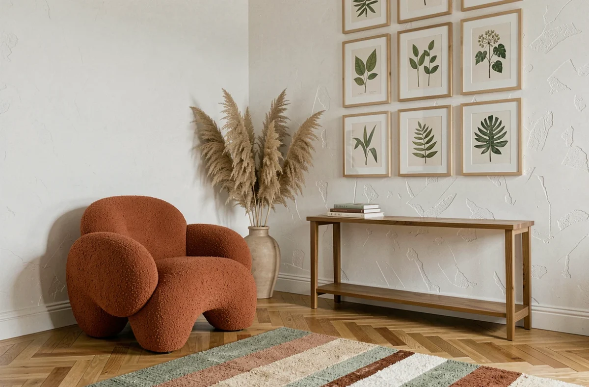
Transforming an interior is not just about accumulating objects or following a current trend. The choice of wall color, flooring, or lighting modifies both the atmosphere of a room and its daily comfort. The best decorating ideas take into account concrete parameters: the available natural light, indoor air quality, and the compatibility of materials with the actual use of each space.
Thermal comfort and decoration: aesthetic choices that change the temperature of a room
Most decorating guides overlook a measurable parameter: the effect of coverings and textiles on the perceived temperature in a home. Light shades applied to walls exposed to the sun reflect more radiation, which helps limit overheating in summer.
The choice of curtains plays a similar role. Exterior solar protections, combined with thick sheers on the inside, reduce heat gain without sacrificing natural light. This link between aesthetics and thermal comfort allows for the selection of colors and materials based on functional criteria, not just visual ones.
By browsing various decorating ideas on Habitat Guides, it is clear that the most sustainable proposals always combine a style choice with a logic of use: window orientation, exposure, air circulation.
| Decor parameter | Impact on summer comfort | Visual impact |
|---|---|---|
| Light paint on south-facing wall | Reflects radiation, limits overheating | Visually enlarges the room |
| Blackout lined curtains | Reduces heat gain through glazing | Adds texture and volume |
| Light wood flooring | Less thermal accumulation than dark tiles | Enhances ambient brightness |
| Exterior solar protections | Filters radiation before it reaches the glazing | Frames the window, structures the facade |

Indoor air quality: choosing paints and furniture without compromising health
A change in decoration often involves new paints, recent furniture, and sometimes a new flooring. Each of these elements can emit volatile organic compounds (VOCs) for weeks after installation.
The VOC emissions label helps compare construction products, but the information is less uniform for furniture. Two seemingly identical pieces of furniture can have very different emission levels depending on the glues, varnishes, and panels used.
Before purchasing, checking the composition of finishes and structural panels provides a more reliable indication than just the visual aspect. After the work, prolonged ventilation during the first days significantly reduces the concentration of pollutants in the renovated space.
Criteria to check before a decor purchase
- Presence of the emissions label on paints and floor coverings, with a rating as close to A+ as possible
- Composition of furniture panels (particle board, MDF, solid wood) and type of glue used
- Nature of finishes: a water-based varnish generally emits fewer VOCs than a solvent-based polyurethane varnish
- Possibility of ventilating the room for an extended period after installation
Reuse of old materials: adding character without improvisation
Recovering a floorboard, an old door, or cement tiles to integrate into a decorating project brings a uniqueness that new materials find difficult to replicate. This approach is appealing for its aesthetics and environmental dimension.
Appearance alone does not guarantee either technical compatibility or the performance of reused materials. An old floor may have irregular thicknesses, surface treatments incompatible with underfloor heating systems, or wood species whose hardness is unsuitable for the intended use.
Reuse requires prior assessment. Checking the structural condition, exact dimensions, and origin of the material avoids costly adjustments during the project. Selecting the recovered piece before finalizing the project design remains the safest method to ensure the result meets the intention.
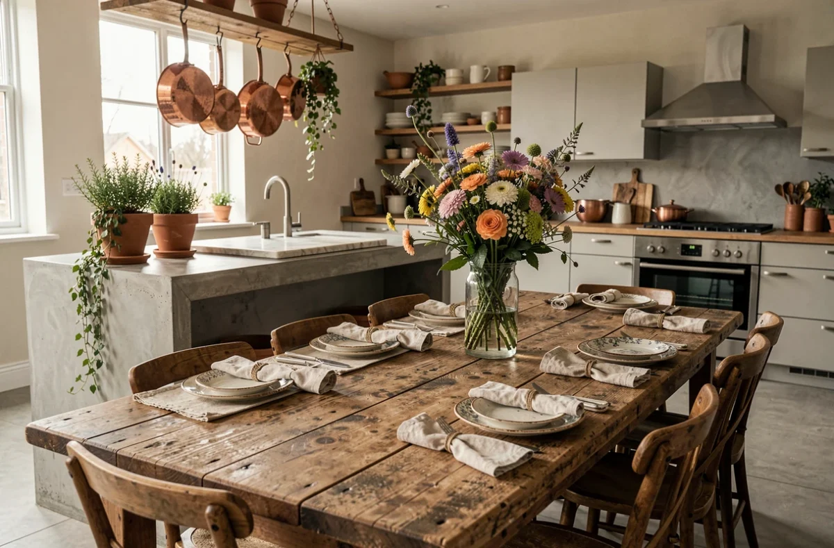
Colors and natural light: adapting the palette to the actual orientation of the room
A color perceived as warm in a showroom can turn dull in a north-facing room. Orientation determines the temperature of the light that enters: cold and bluish in the north, warm and golden in the south or west in the late afternoon.
Adapting shades to exposure
In a north-facing space, colors with warm undertones (ochre, terracotta, golden beige) compensate for the coldness of the light. Conversely, a room bathed in direct sunlight can support cooler shades (bluish gray, sage green, cool-based off-white) without appearing austere.
Testing a paint sample directly on the concerned wall for several days allows for observing color variations between morning, noon, and evening. This often-overlooked step prevents disappointments after the complete painting.
- North-facing room: prioritize warm tones and satin finishes that better capture low-angle light
- South-facing room: light and matte shades limit glare while preserving brightness
- East or west-facing room: play with neutral colors that adapt to both light temperatures throughout the day
The choice of a decorating style, whether based on solid wood furniture, vintage finds, or contemporary pieces, benefits from being confronted with these concrete data. A successful interior articulates style elements with the physical constraints of each room: orientation, glazed surface, ceiling height. It is this articulation, more than the accumulation of decorating ideas, that creates a space where one feels good for the long term.